Introduction
A Mobile Friendly Website is a website that is designed and optimized to work properly on smartphones, tablets, and other mobile devices. In today’s digital world, most internet users access websites through mobile phones. Therefore, having a Mobile Friendly Website is no longer optional; it has become a necessity for businesses, bloggers, and website owners.
Google also uses mobile-first indexing, which means it primarily considers the mobile version of a website when determining search rankings. If your website is not mobile-friendly, you may lose visitors, rankings, and potential customers.
In this guide, you will learn what a Mobile Friendly Website is, why it is important, its benefits, and how to create a website that performs well on mobile devices.
What is a Mobile Friendly Website?
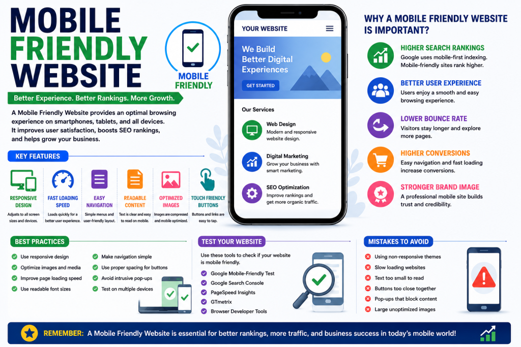
A Mobile Friendly Website is a website that automatically adjusts its layout, content, images, and functionality according to different screen sizes and devices.
A mobile-friendly website ensures that users can:
- Read content without zooming
- Navigate easily
- Click buttons comfortably
- Access information quickly
- Enjoy a smooth browsing experience
The primary goal of a Mobile Friendly Website is to provide a positive user experience across all devices.
Why is a Mobile Friendly Website Important?
A Mobile Friendly Website plays a major role in modern SEO and user engagement.
1. Improves User Experience
Visitors are more likely to stay on a website that is easy to use on mobile devices.
2. Increases Search Engine Rankings
Google rewards mobile-friendly websites with better rankings in search results.
3. Reduces Bounce Rate
When users can easily navigate a website, they are less likely to leave immediately.
4. Increases Conversions
A Mobile Friendly Website makes it easier for users to complete purchases, submit forms, and contact businesses.
5. Supports Mobile Users
Since mobile traffic continues to grow, businesses must provide an optimized experience for mobile visitors.
Key Features of a Mobile Friendly Website
Responsive Design
Responsive design automatically adjusts website content based on screen size.
Benefits include:
- Better usability
- Consistent experience
- Improved SEO
Fast Loading Speed
Mobile users expect websites to load quickly.
A Mobile Friendly Website should:
- Optimize images
- Minimize code
- Use browser caching
- Improve server response time
Easy Navigation
Menus and navigation should be simple and accessible on small screens.
Readable Content
Text should be large enough to read without zooming.
Mobile-Friendly Buttons
Buttons and links should be easy to tap without accidentally clicking other elements.
Optimized Images
Images should resize automatically to fit different screen sizes.
Benefits of a Mobile Friendly Website
Better Search Rankings
Google prioritizes mobile-friendly websites in search results.
Increased Organic Traffic
Higher rankings often lead to more visitors.
Improved User Engagement
Users spend more time on websites that are easy to navigate.
Higher Conversion Rates
A positive mobile experience increases the chances of conversions.
Enhanced Brand Reputation
A professional mobile-friendly website creates a positive impression on visitors.
Mobile Friendly Website and SEO
A Mobile Friendly Website is a critical part of SEO.
Google’s mobile-first indexing means that the mobile version of your website is used for ranking and indexing purposes.
Important SEO benefits include:
- Improved rankings
- Better user experience
- Lower bounce rates
- Faster page speed
- Increased visibility
Without a Mobile Friendly Website, achieving strong SEO results becomes much more difficult.
How to Create a Mobile Friendly Website
Use Responsive Design
Responsive design is one of the best ways to make a website mobile-friendly.
Optimize Page Speed
Improve loading speed by:
- Compressing images
- Reducing unnecessary scripts
- Using caching techniques
Use Mobile-Friendly Fonts
Choose readable font sizes and styles.
Optimize Images
Large images can slow down mobile websites.
Use:
- Compressed images
- Modern image formats
- Responsive image sizes
Improve Navigation
Keep menus simple and easy to use.
Avoid Pop-Ups
Excessive pop-ups can negatively impact mobile user experience.
Test Your Website Regularly
Check your website on different devices to ensure everything works properly.
Common Mobile Friendly Website Mistakes
Many website owners make mistakes that affect mobile performance.
Slow Loading Speed
Slow websites often lose visitors quickly.
Small Text Sizes
Text that is difficult to read creates a poor user experience.
Unresponsive Design
Websites that do not adapt to different screen sizes can frustrate users.
Poor Navigation
Complicated menus make it difficult for users to find information.
Large Images
Oversized images increase loading times.
Clickable Elements Too Close Together
Buttons should have enough space to prevent accidental clicks.
Best Tools to Test a Mobile Friendly Website
Several tools can help evaluate mobile performance.
Google Search Console
Provides reports related to mobile usability issues.
Google PageSpeed Insights
Analyzes speed and performance.
GTmetrix
Measures page speed and optimization opportunities.
Lighthouse
Provides detailed website performance audits.
Browser Developer Tools
Allow testing across multiple device sizes.
Mobile Friendly Website Best Practices
Follow these practices for the best results:
- Use responsive design
- Optimize page speed
- Compress images
- Use readable fonts
- Keep navigation simple
- Test regularly
- Avoid intrusive pop-ups
- Improve Core Web Vitals
These strategies help improve both SEO and user experience.
Future of Mobile Friendly Websites
As mobile usage continues to increase, the importance of a Mobile Friendly Website will continue to grow. Search engines are placing greater emphasis on mobile usability, speed, and user experience.
Businesses that invest in mobile optimization today will have a significant advantage over competitors who ignore mobile users.
Conclusion
A Mobile Friendly Website is essential for modern businesses, bloggers, and website owners. It improves user experience, increases search engine rankings, reduces bounce rates, and helps generate more conversions. With Google prioritizing mobile-first indexing, creating a Mobile Friendly Website should be a top priority for anyone looking to succeed online.
By implementing responsive design, optimizing page speed, improving navigation, and regularly testing performance, you can ensure your website provides an excellent experience for mobile users and achieves long-term SEO success.